
Arivin Therapeutics
The whole science, rebuilt to be read
Arivin develops antibacterial therapeutics that disarm bacteria instead of killing them. The mechanism needs a paragraph to explain, so I kept every word of the company’s content, gave it a sequence, and designed thirteen pages and the design system behind them.
- Industry
- Biotech and deep tech
- Audience
- B2B, investors, partners and scientists
- Year
- 2026
- Type
- Commercial project
- Role
- Product designer, end to end
- Scope
- Information architecture, 13 pages, design system, motion and build
- Built with
- Claude Code
- HTML, CSS, JavaScript
- GSAP for animation
- Lenis for smooth scroll
The project
in short
The goal
- A redesign with a new visual language
- Every word of the existing content kept
- A counter-intuitive mechanism that people can follow
What I did
- Audited the old site, the identity manual and the publications
- Chose one sequence, from the question to the mechanism, the evidence, the pipeline and the people
- Cut eighteen candidate pages to thirteen
- Designed the system with its own specification page, then built the site with Claude Code
The result
- The mechanism is explained before any number asks to be read
- News, publications and openings are index pages that survive growth
- Every state has a screen, including an empty filter, a wrong address and a sent form
- A design system a developer can follow without asking me
The challenge
Content parity. Nothing the company had written could be dropped, yet a scientific argument has to be read in order. The answer was a sequence, not a summary.
A biotech company is judged on credibility long before it is judged on design. Nobody funds a mechanism they could not finish reading.
The home page,
top to bottom
The argument in the order a sceptic needs it, from the question and the problem to the turn, why it lasts and the pipeline. This is a preview of the site, not the live page. Scroll to walk it.
- The questionFuture-Proof antimicrobial therapies to halt resistant infections. The claim and one action before the fold.
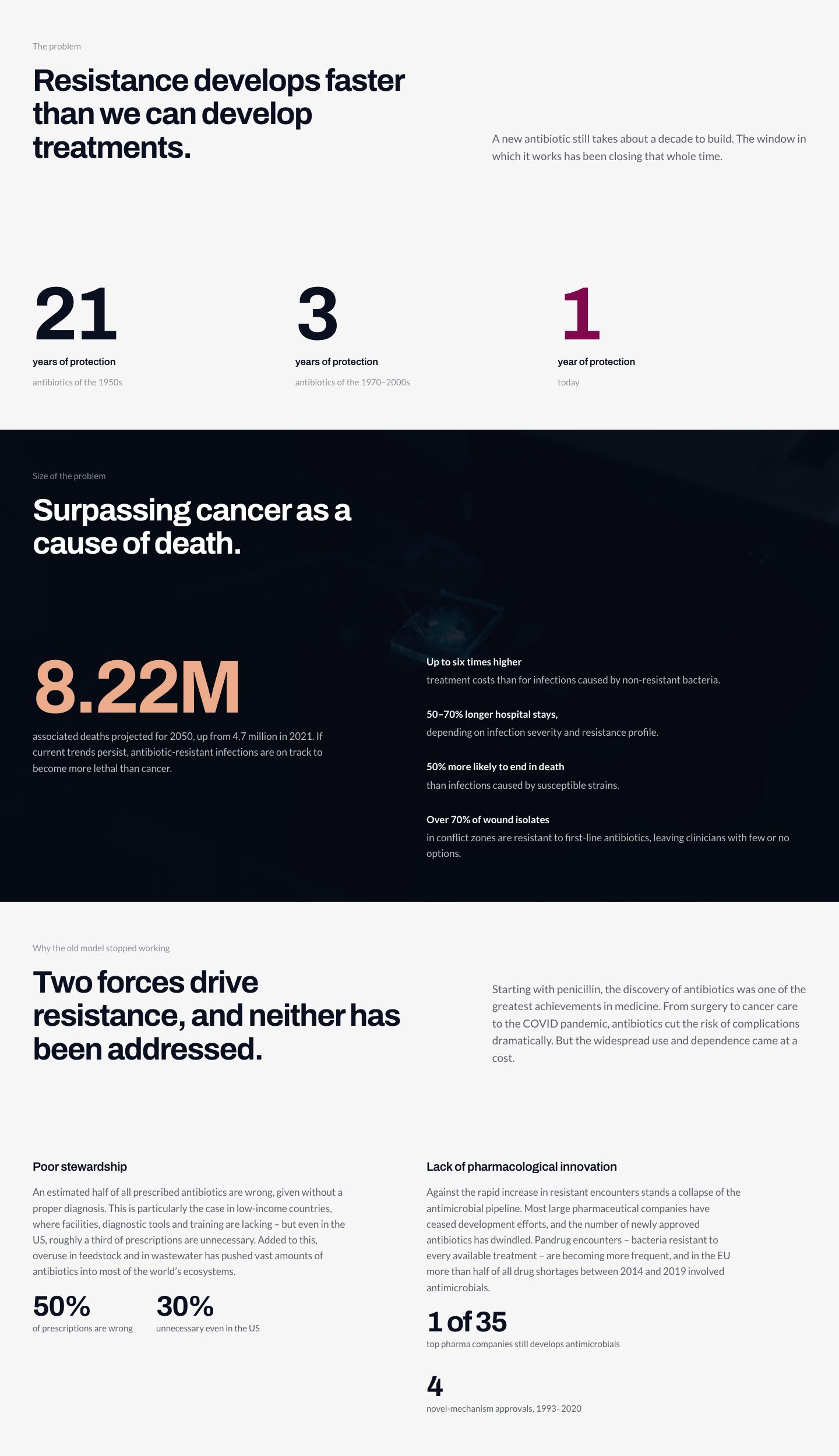
- The problemResistance develops faster than we can develop treatments. Three numbers show the size of the problem and the two forces behind it.
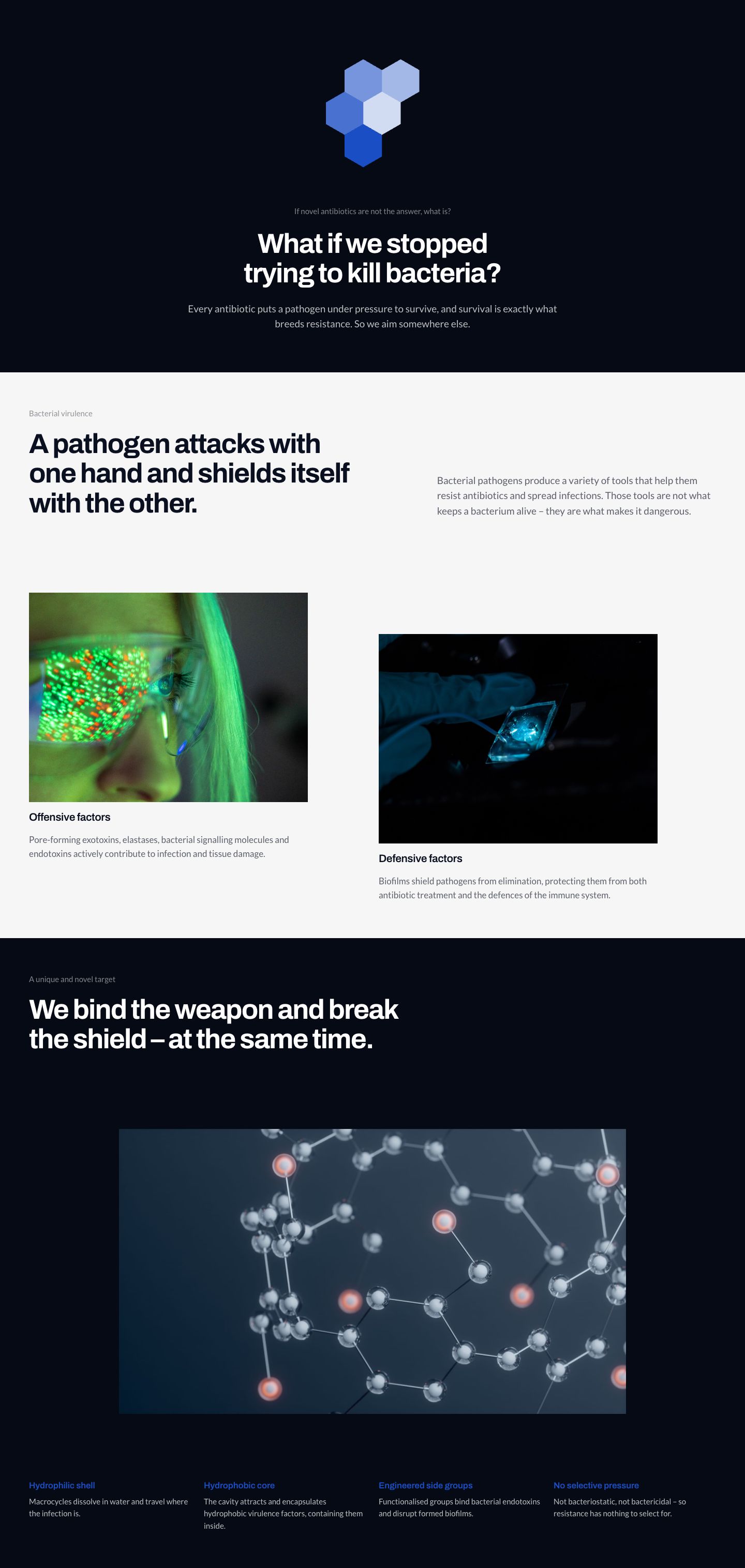
- The turn and the mechanismWhat if we stopped trying to kill bacteria? A pathogen attacks with one hand and shields itself with the other; the therapy binds the weapon and breaks the shield at the same time.
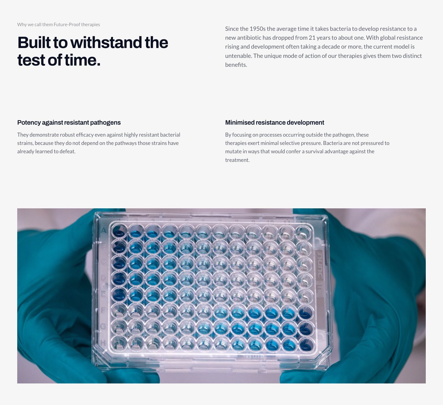
- Why it lastsBuilt to withstand the test of time, with potency against resistant pathogens and minimised resistance development.
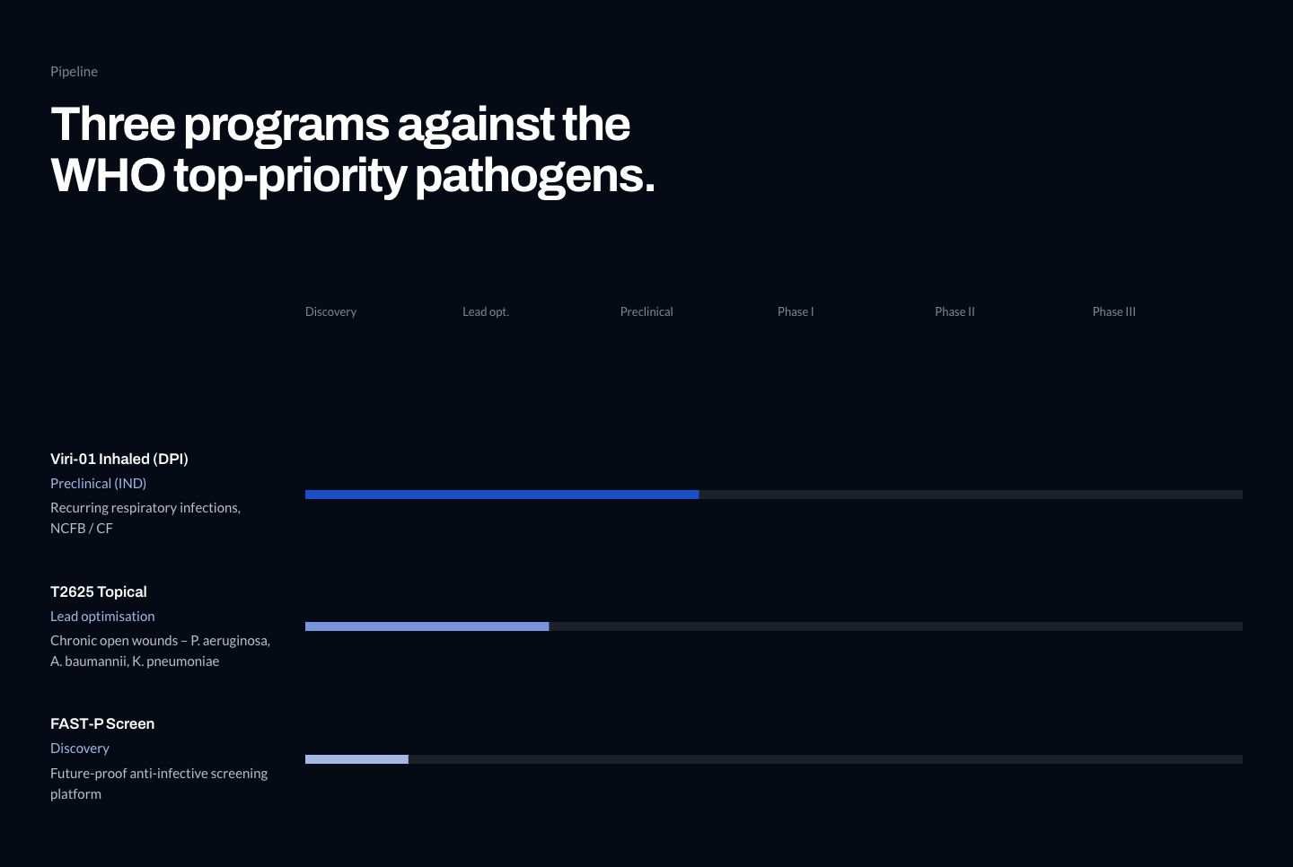
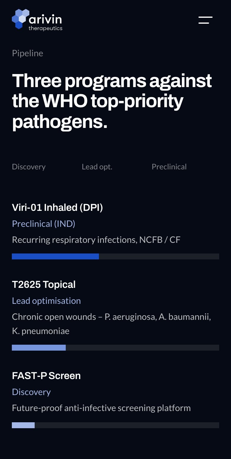
- The pipelineThree programs against the WHO top-priority pathogens, each shown at its real stage.
Same content,
new sequence
The shortest way to show the work is the same page twice. On a computer keep scrolling, on a phone drag the handle, and the earlier one gives way — both carry the company's own text and photography; what changed is the order, the hierarchy and the depth of the detail behind each step.

Before Arivin Therapeutics, home page. Same content, same photography, same company. After
BeforeThe page opened on the wordmark and the tagline, with the science set out in the sections below. The mechanism was reachable, and it arrived after the reader had already decided whether to keep going.
AfterThe page opens with the question the therapy answers, then the mechanism, then the evidence. The statement is still there — it now lands on a reader who knows what Arivin does.
Science pageClick a screen, then scroll inside it
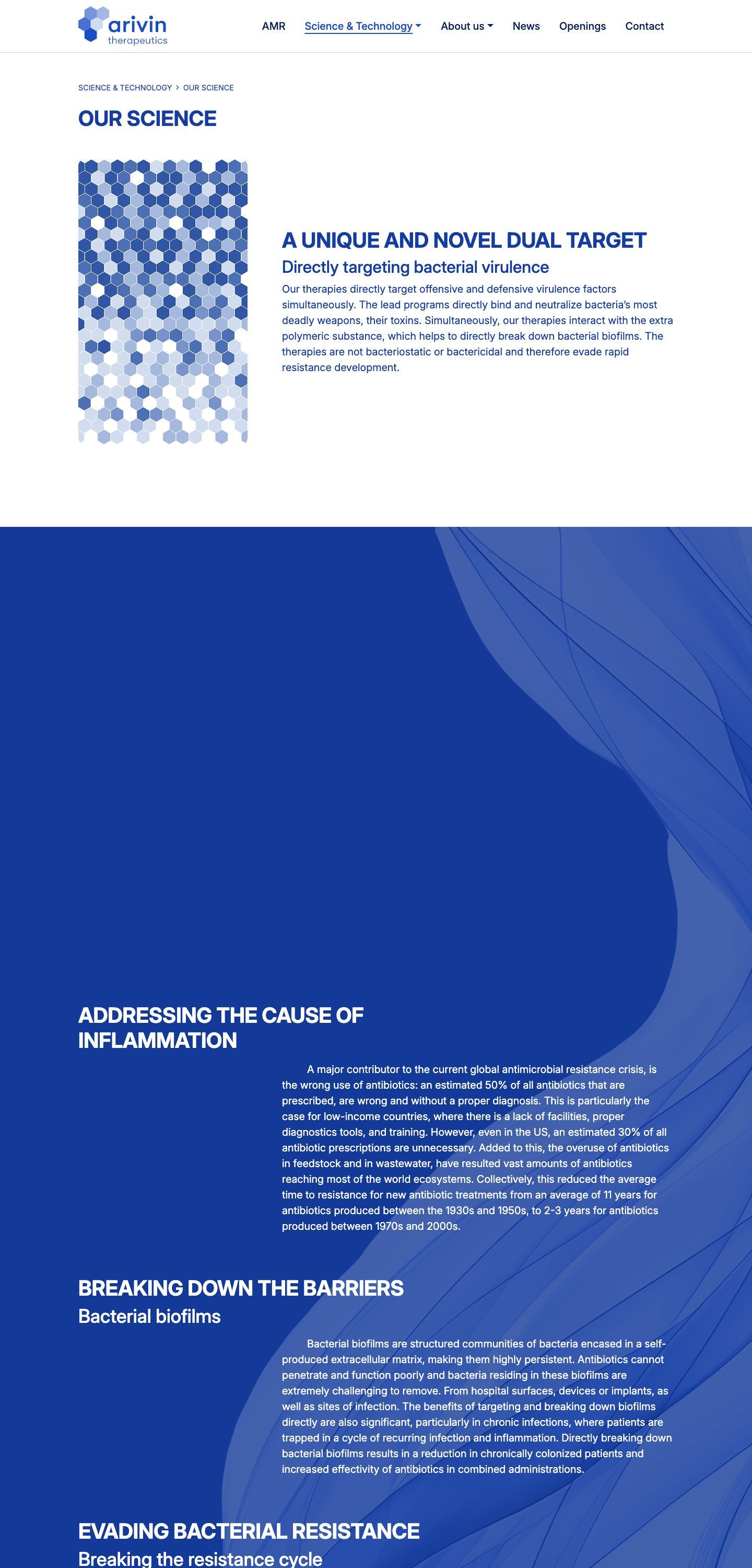
Science, beforeA heading, a strip of decorative hexagons and one column of blue text. Everything is present, but nothing says which sentence matters most.
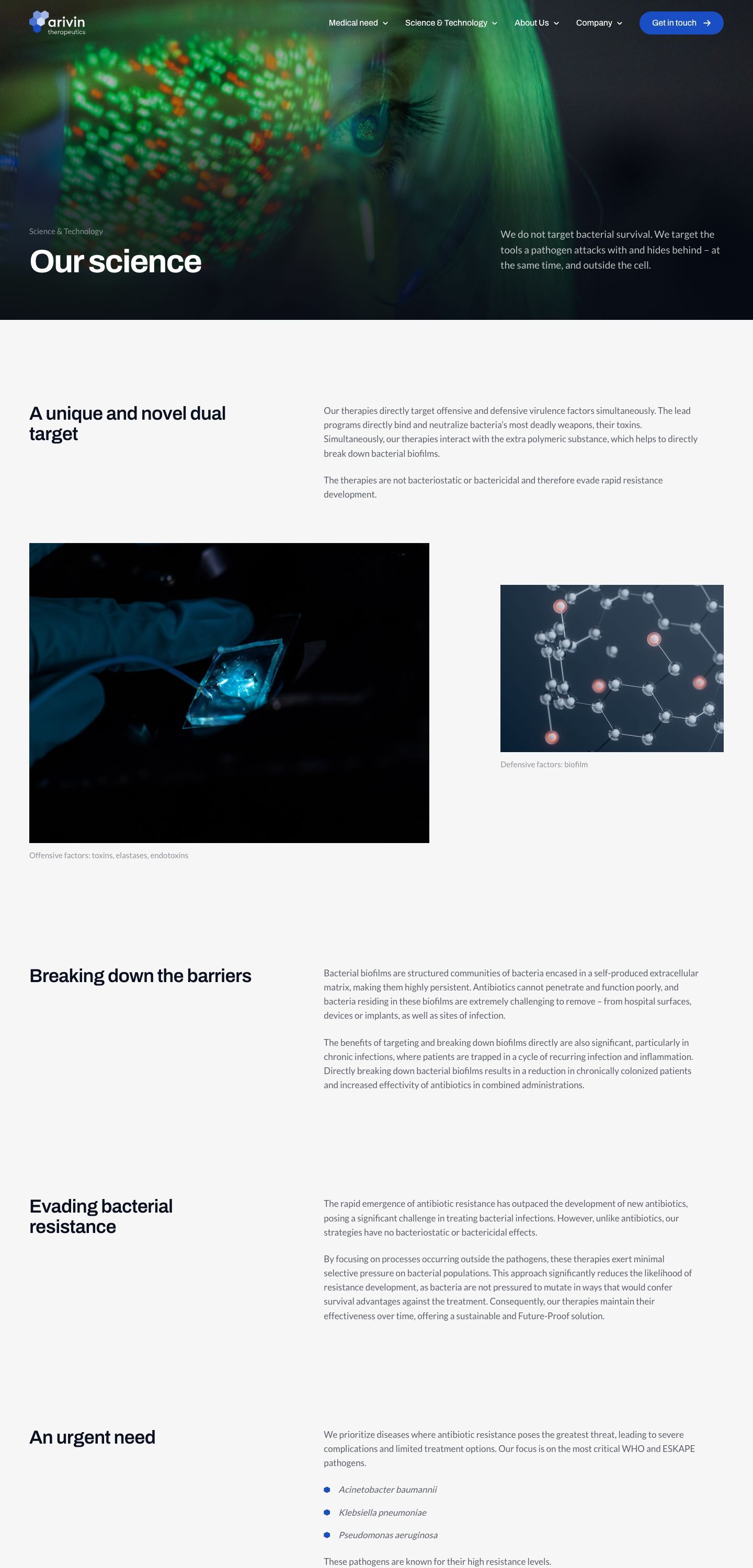
Science, afterThe same page opens on the company’s own sentence, “We do not target bacterial survival”, over a photograph, and the dual-target explanation follows as a heading and a reading column instead of one block of blue text.
Pipeline pageClick a screen, then scroll inside it
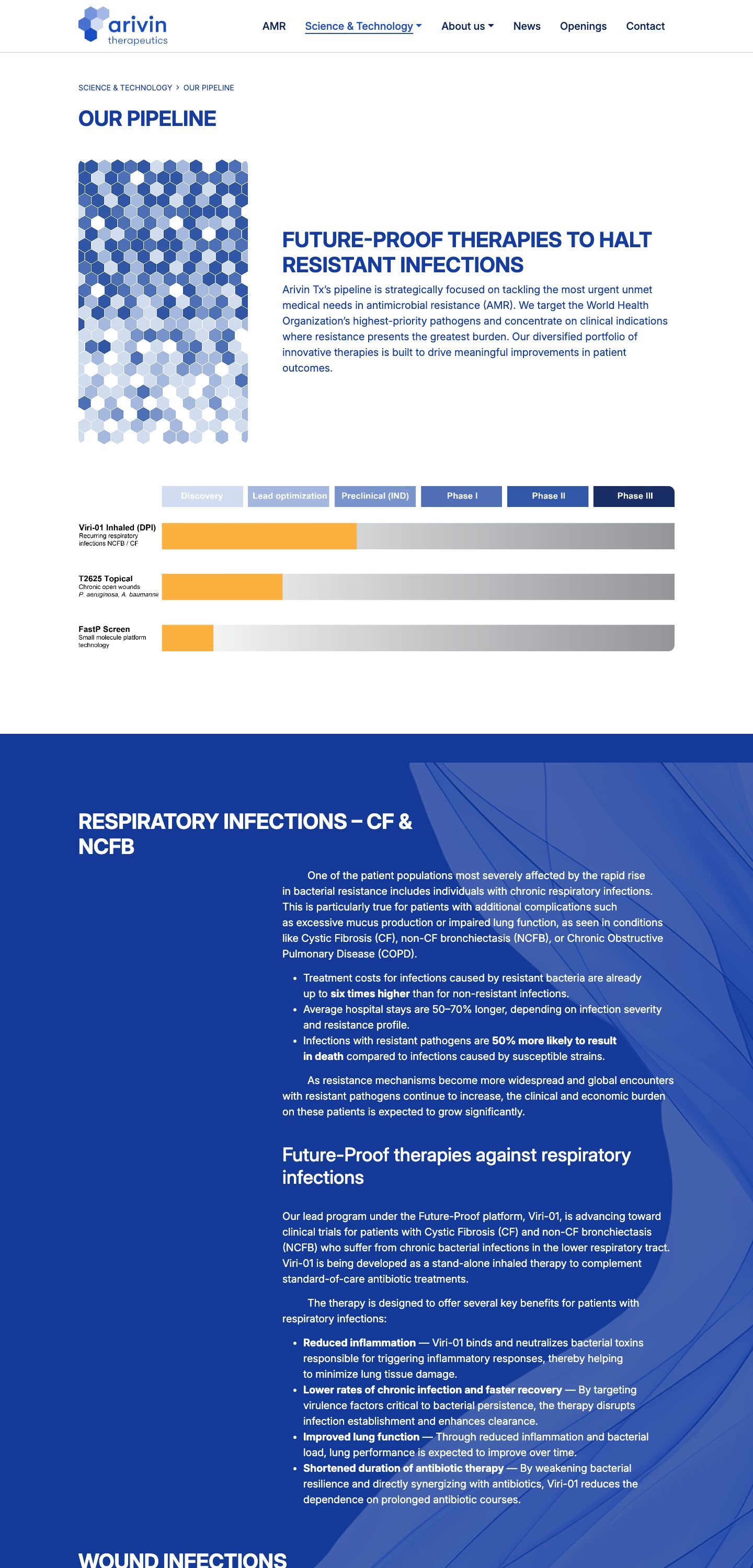
Pipeline, beforeProgrammes and their stages written out as text, with the stage named in each line.
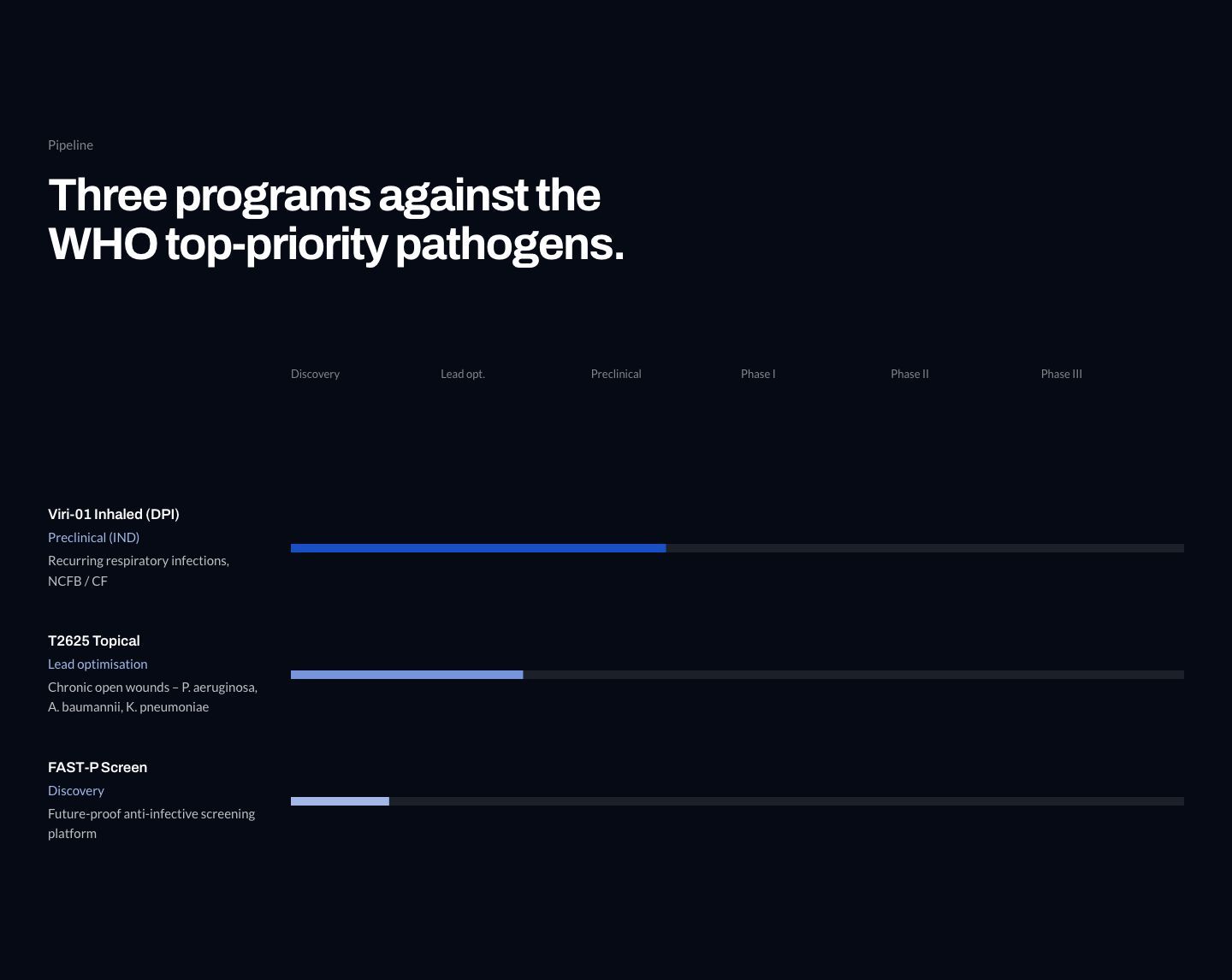
Pipeline, afterEach programme is an indicator positioned at its real stage, so a visitor can see how far the portfolio has come without reading a single row. The numbers animate from the values in the content, not from decoration.
Keep every word,
change the order
The brief
A redesign with a new visual language and one hard rule. Nothing the company had written could be dropped. Investors, partners and hiring scientists all read the detail, so the science stays in full and the order does the work.
The idea to land first
Arivin’s therapy disarms bacterial virulence instead of killing the cell, which is why resistance does not develop. Until that idea lands, every number below it is hard to read. So the site follows one sequence. It poses the question, shows the mechanism, backs it with peer-reviewed evidence, then moves to the pipeline, the alliance and the team.
What I changed
- A page needs a reasonEighteen candidate pages came out of the content and thirteen shipped. A topic gets its own page when it outgrows a home page block or is a list that keeps growing.
- Lists built to growNews, publications and openings are filtered index pages with their own article pages, so five items or fifty both fit.
- Contact in the menuContact is part of the navigation and has a working form with a confirmation page.
- Every state has a screenAn empty filter, a wrong address, no open positions and a sent form each have a written screen.
Three decisions
and their cost
Every one of these bought something and gave something up. Writing down the second half is what makes the first half a decision.
Hexagons, not a 3D molecule
A rotating molecular render was the obvious move for a biotech site, and it was prototyped. The hexagon cluster from the company's own mark does the same job — geometry that reads as science — and it is the brand rather than a stock idea of it.
Cost. No literal molecule anywhere on the site. In exchange the first screen runs at full frame rate on a phone and weighs kilobytes instead of megabytes.Thirteen pages, not eighteen
Topics that fit inside a homepage block stayed there — the mechanism, the pipeline, the alliance, the team. Only growing lists and genuinely deep subjects got a page of their own, which keeps the menu to five entries plus contact.
Cost. The homepage is long, and it leans on a menu that stays reachable the whole way down. The alternative was a navigation no visitor could hold in their head.One piece of theatre, then restraint
The intro is the only animation allowed to take time. Everything after it is short and functional, with text setting in lines, counters running to their real values and indicators filling to the stage a programme has actually reached.
Cost. Visitors who land on an inner page never see the signature moment. The scientific content is what they came for, and it loads immediately.The design
system
Arivin had an identity manual and no design system. I built one out of it — 122 tokens that every page is assembled from, so nothing on the site is a one-off value.
Colour
Five tints, and they are the logo
The ramp is not picked to look good next to the photographs. It is the five hexagons of the mark, taken from the identity manual at 100, 80, 60, 40 and 20 per cent, so the brand and the interface are the same five values.
Surfaces
Four surfaces, and one of them is for a single number
Sections alternate between dark and light the whole way down the page. Every text colour in the system is approved against each of these four, including the scrim ramp that sits over photographs.
Type
Archivo to say it, Lato to explain it
Fourteen sizes on one fluid scale. Components are not allowed to set a size of their own, so a heading is the same heading on all thirteen pages. Shown here at the desktop end of each clamp.
Future-Proof therapies
Section headline
Sub-section
Card title
Lead paragraph. Arivin targets bacterial virulence, not bacterial survival.
Running text. Binding toxins and breaking down biofilm without driving new resistance.
Caption and meta, used under figures and in list rows.
Photography Mikko Raskinen, Aalto University
Space
Fourteen steps on a 4 px base
Two named tokens sit on top of the scale and carry the rhythm of the whole site. They are the padding of a section and the gap under every heading. That is why the air is the same in all thirteen pages, and why the inside of a block is always tighter than the gap between blocks.
Components
One button, four surfaces
No uppercase anywhere in the system, and no monospace — including on buttons and chips. The pill is the only shape, and which variant appears is decided by the surface underneath it, not by importance.
The brand module
One shape draws the logo, the aperture and the bullets
The five hexagons of the logo are the only vector graphic on the site. The same coordinates draw the mark, the opening aperture of the first screen and the bullets in lists — so nothing on the page is a decoration someone added.
- Cell
- Pointy-top hexagon, width w
- Height
- w × 1.1547
- Row offset
- w / 2
- Vertical step
- 0.866 w
- Cells
- Five, one per tint of the ramp
What it forbids
Enforced, not documented
A design system that lives in a document drifts within a month. This one is checked by a linter that fails the build, which is why the site still matches it.
- No raw valuesA hex, a pixel padding or an easing written anywhere outside the token file fails the build. If a value is needed, it becomes a token first.
- No font sizes in componentsSize comes only from a scale class, so a card cannot invent a heading one step smaller than every other card.
- No unregistered motionEvery appearing element names a motion preset that must exist in the registry. Animation added because it was possible does not pass.
- No uppercase, no monospace, no spacersNot in buttons, not in chips, not as empty elements used to push things apart. Distance comes from the gap of a container.
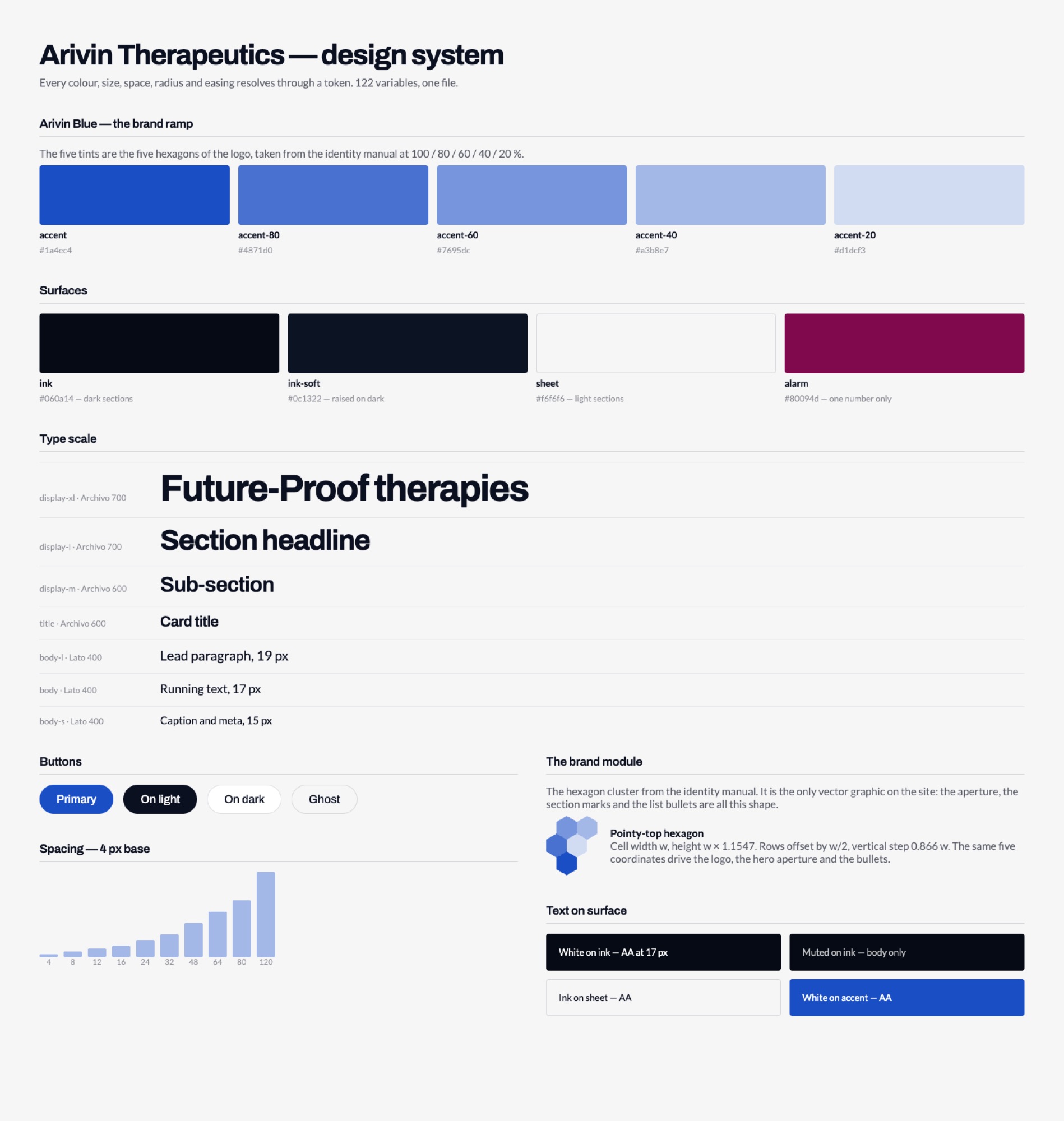
The whole specification is one page
Ten sections — principles, colour, type, layout, components, motion, accessibility, the rules above, and a section written for the tooling that builds from it. It renders straight from the stylesheet the site is built from, so it cannot drift. Change a token and the page changes with it.
Open the design systemHow it works
on a phone
Many visitors open a company site like this on a phone, so mobile was designed next to the desktop, not after it. Every section keeps all of its content and its motion. What changes is the rhythm and the controls — three decisions below.
Click a screen, then scroll inside it
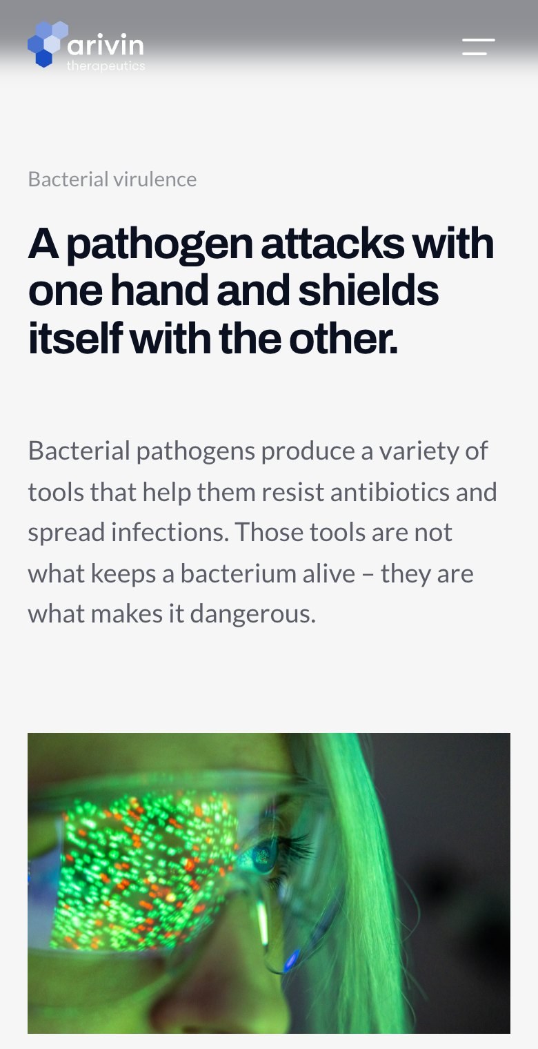

- Mechanism, stackedThe two-column comparison becomes two surfaces one above the other, each still visibly its own side of the argument.
- Team, scrollableThe pinned rail becomes a native swipe with arrows sitting right under the photographs, so it is obvious what they move.
- Pipeline, at a glanceThe programmes stay as rows with a progress bar each, so the stage of every one reads without a table.
See it
running
Thirteen pages, working forms and every state written. Opens in a new tab.