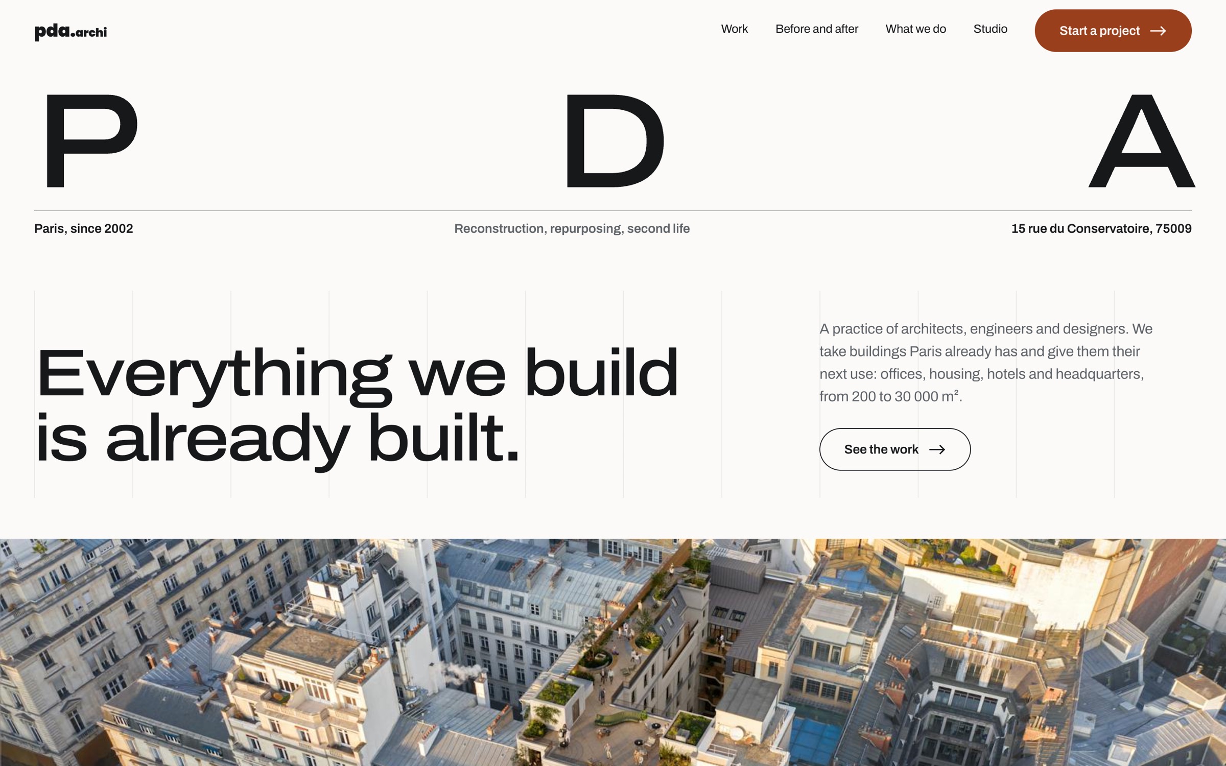
The word shows what it says
“Already” is set so large that it can hold a photograph. Through the letters you see the practice’s own construction site. The picture drifts as you scroll, so the word is never the same twice.
already
Twenty years of architecture, legible in one minute
A Paris practice that gives existing buildings a second life. I rebuilt its site as one English page where the scale, the proof and the strongest argument can be read before the first scroll ends.
A modern, animated brief and heavy photography, against a fast first load. Motion had to earn its place, so each effect carries one idea, and the one pinned section was the price of the horizontal rows.
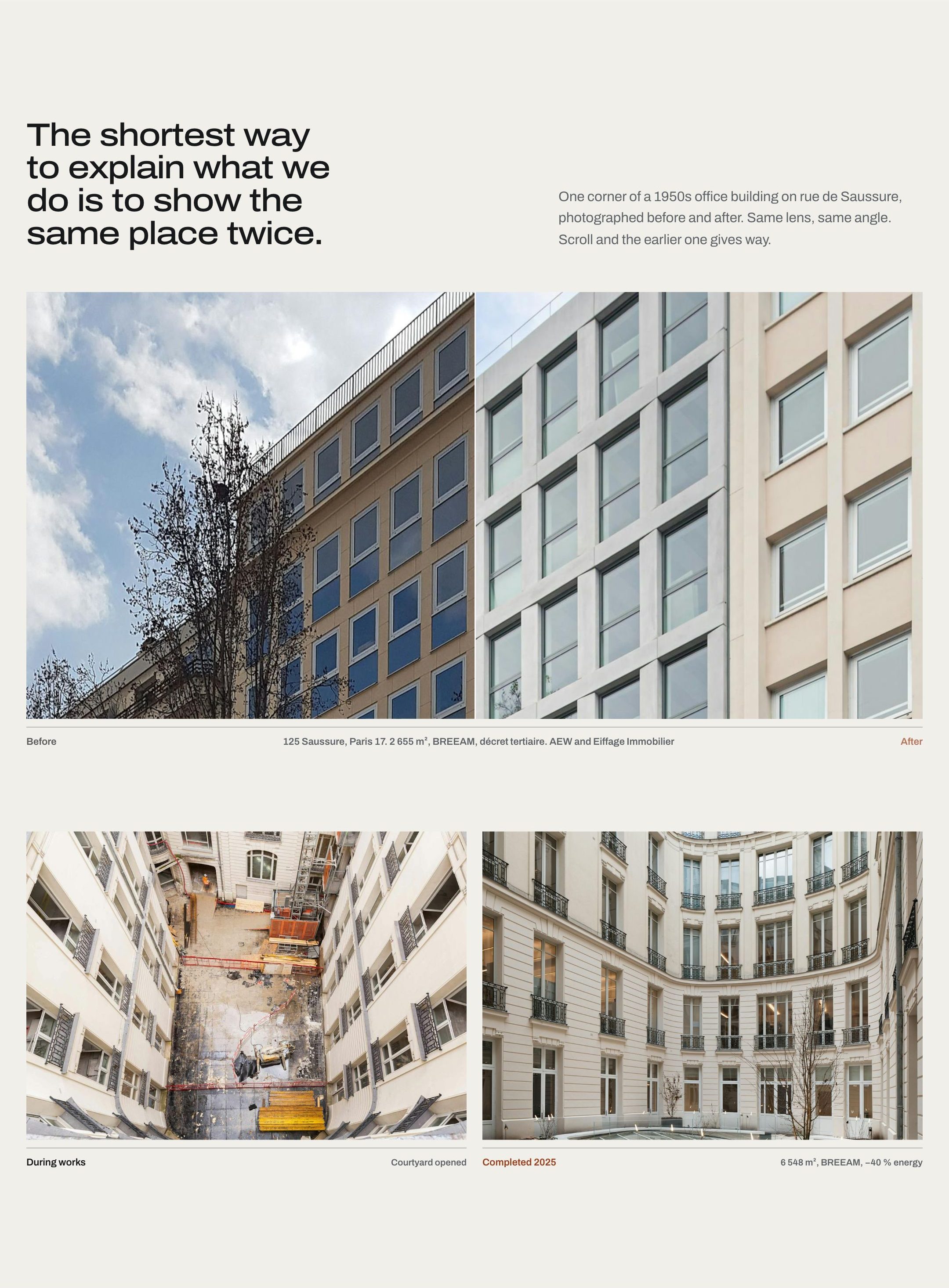
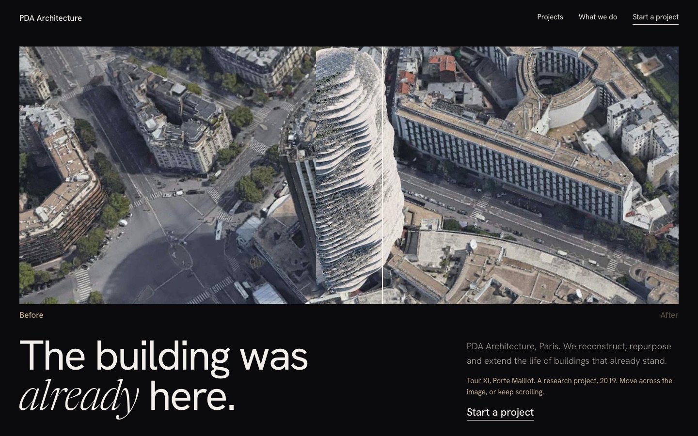
The practice's strongest argument was one it barely showed, the same building before and after.
The page is ordered the way the case is made to a sceptic. This is a preview of the site, not the live page. Scroll to walk it.
The practice has since launched a new site of its own, so the original now exists only in the web archive. Here it is next to my redesign. On a computer keep scrolling, on a phone drag the handle.
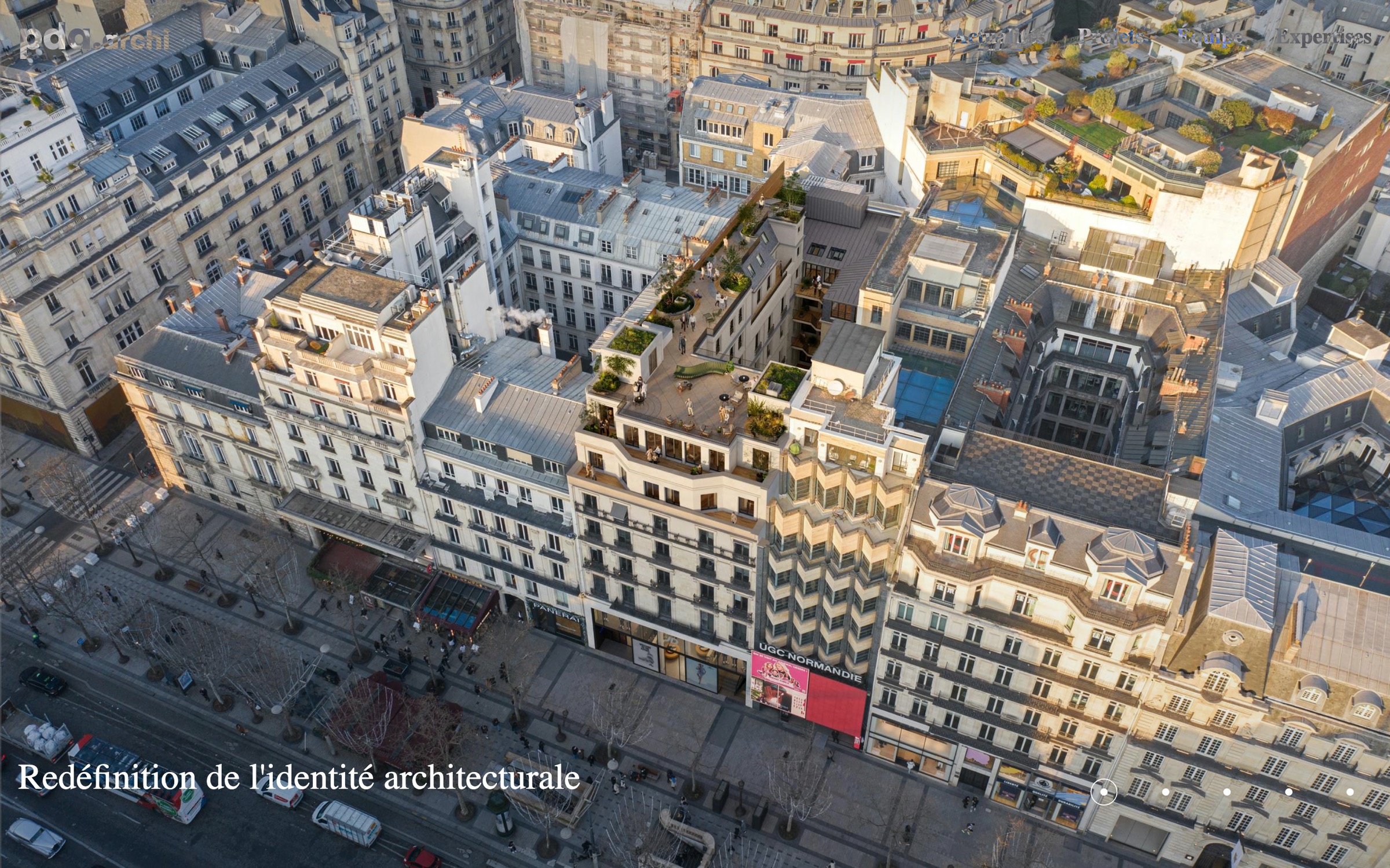
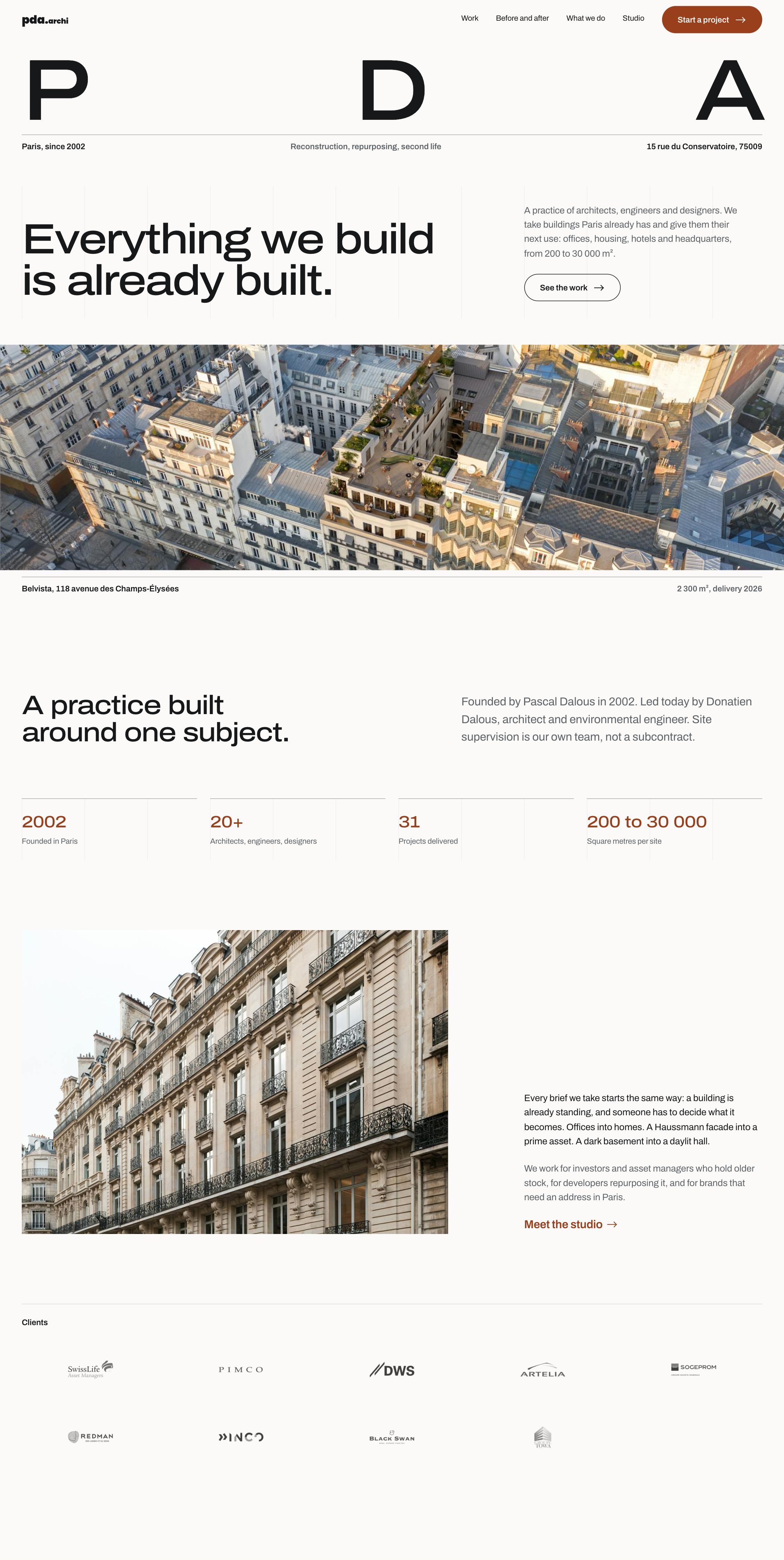
Before pda.archi, home page, as archived in April 2026. After
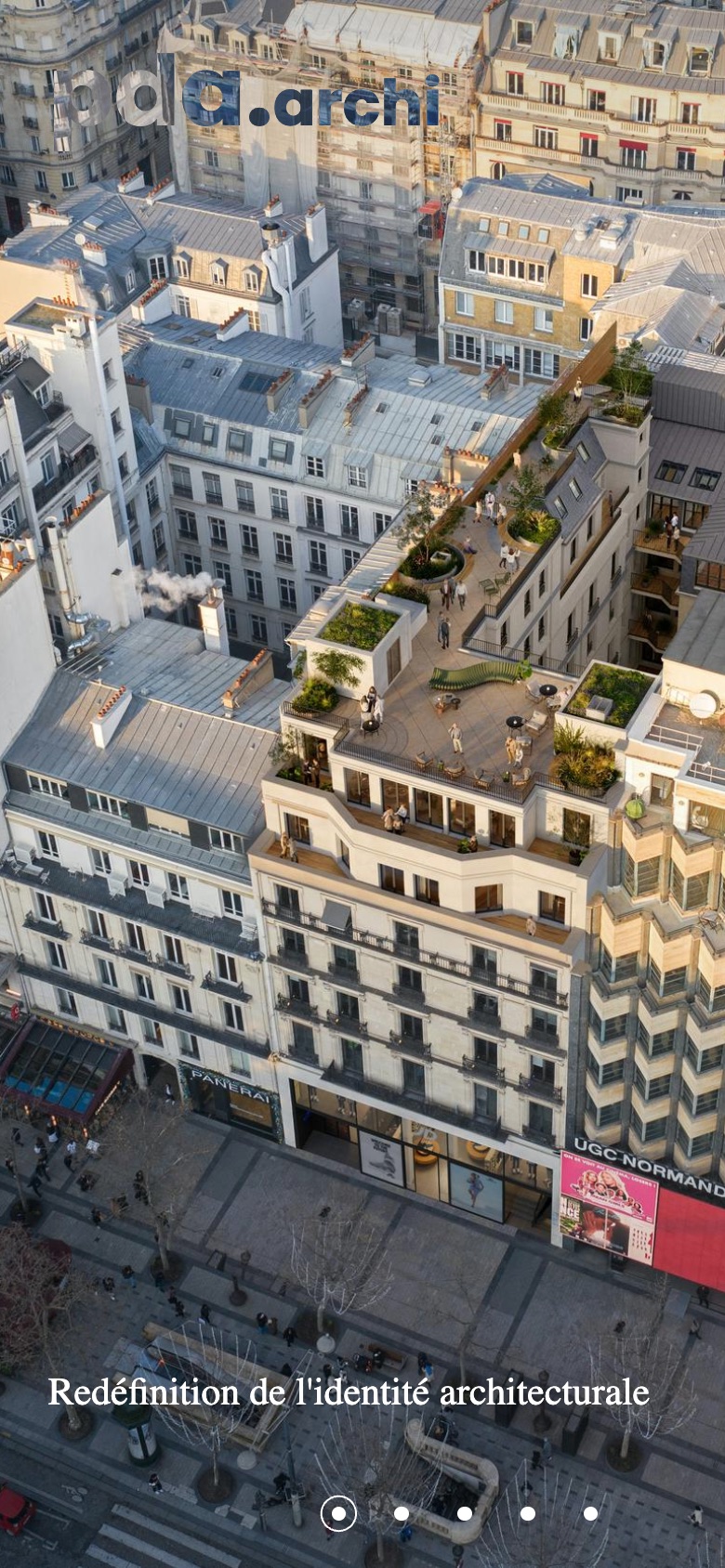
BeforeThe page opened on a full-screen slider with one French line over it. Nothing said what the practice does, how big it is or who it works for, and the logo and menu sat directly on the photograph, where the light parts of the picture swallowed them.
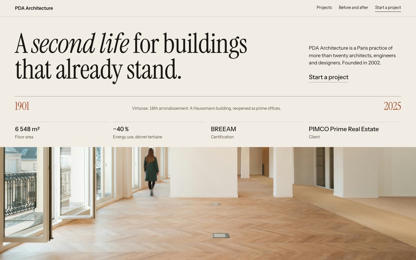
AfterThe page opens with the practice's one subject in a sentence, the year, the place and what it does, then the largest photograph. The same image is still there. It now lands on a reader who knows what they are looking at.
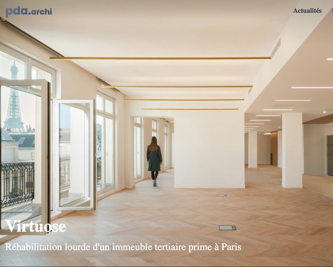
A project, beforeA photograph and one French line. A foreign client learns nothing about the building, such as where it is, how big, who it was for or what was done.
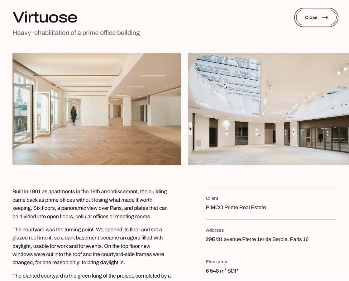
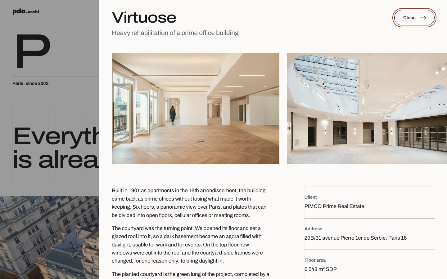
A project, afterThe same building gets a proper sheet of its own, with a gallery, the story and a technical card with client, address, area, dates and certifications.
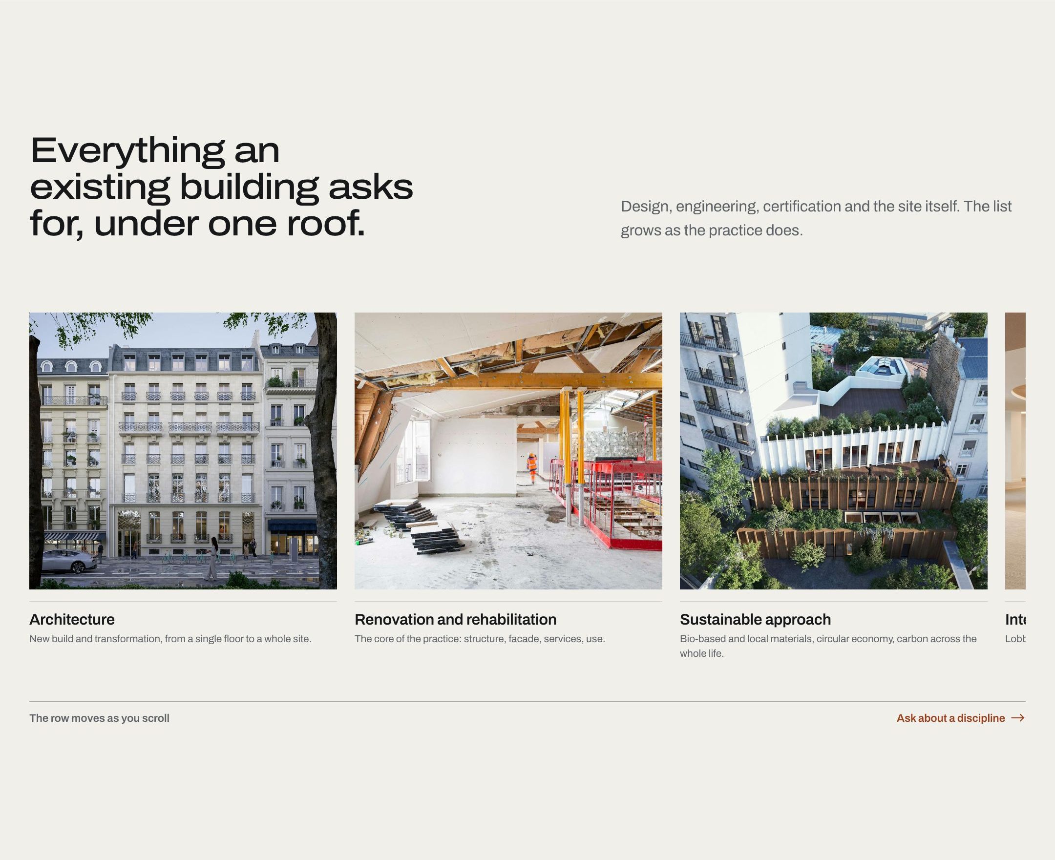
A modern, animated site was part of the task. For a practice that works on buildings that already stand, motion had to earn its place, so each of three effects carries one idea. They run live below, they are not screenshots.
“Already” is set so large that it can hold a photograph. Through the letters you see the practice’s own construction site. The picture drifts as you scroll, so the word is never the same twice.
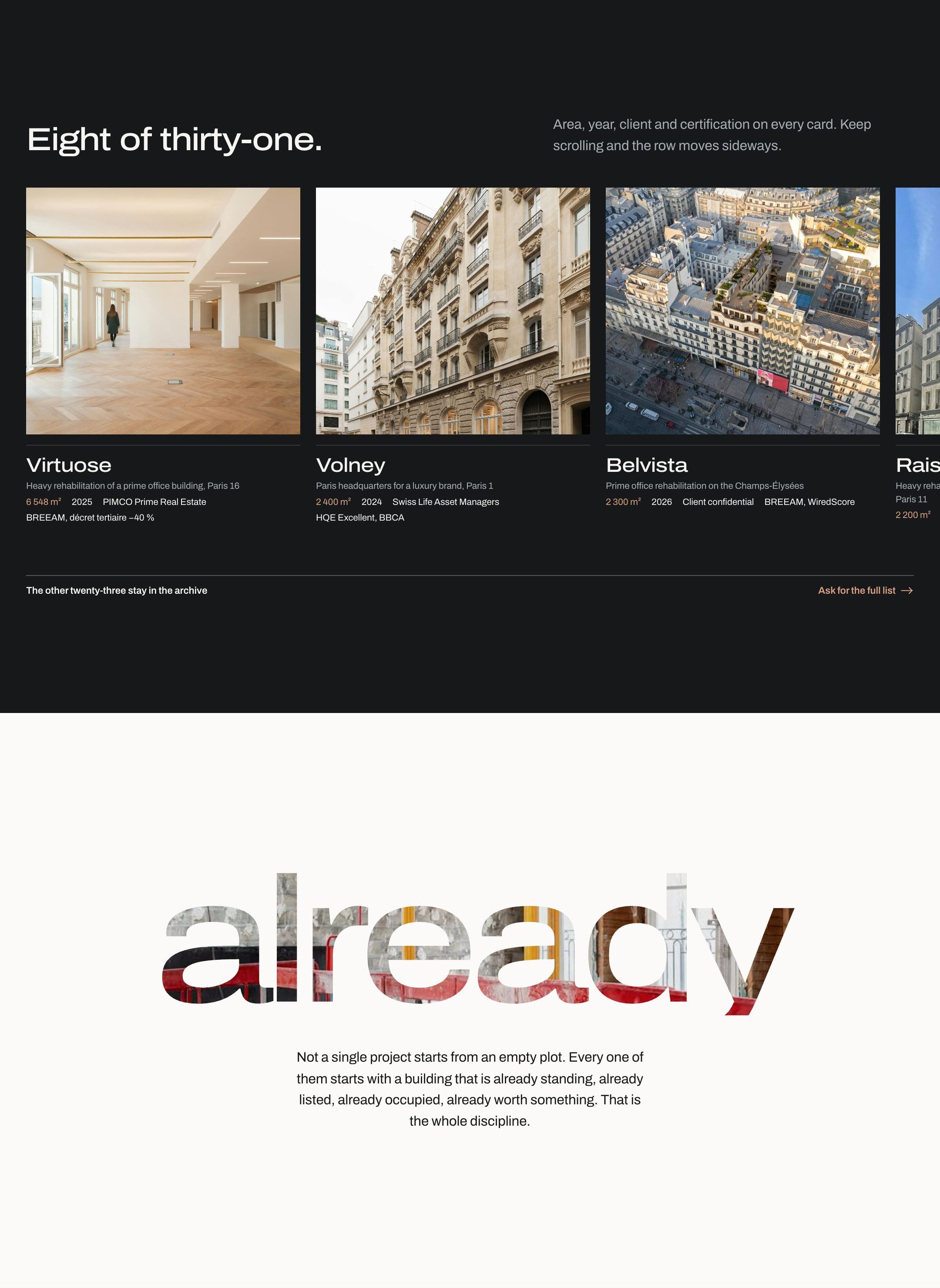
Eight of thirty-one projects sit in one row that travels sideways while you scroll down. The other twenty-three stay in the archive, one click away.
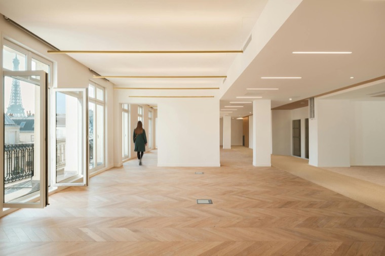
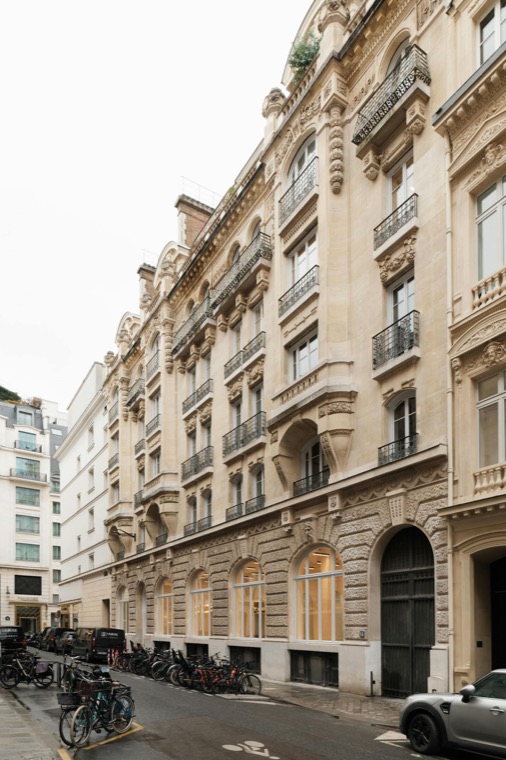
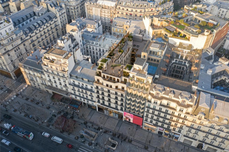
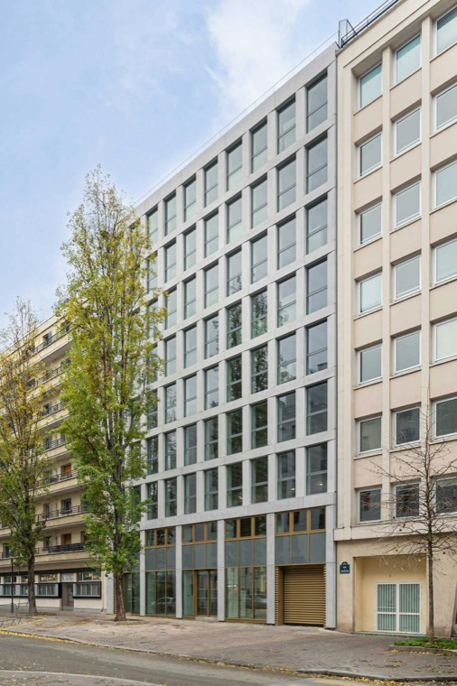
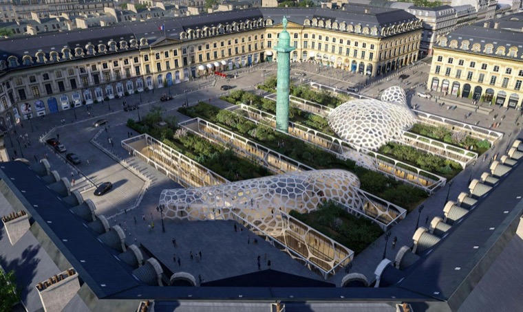
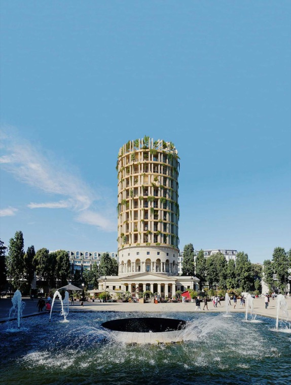
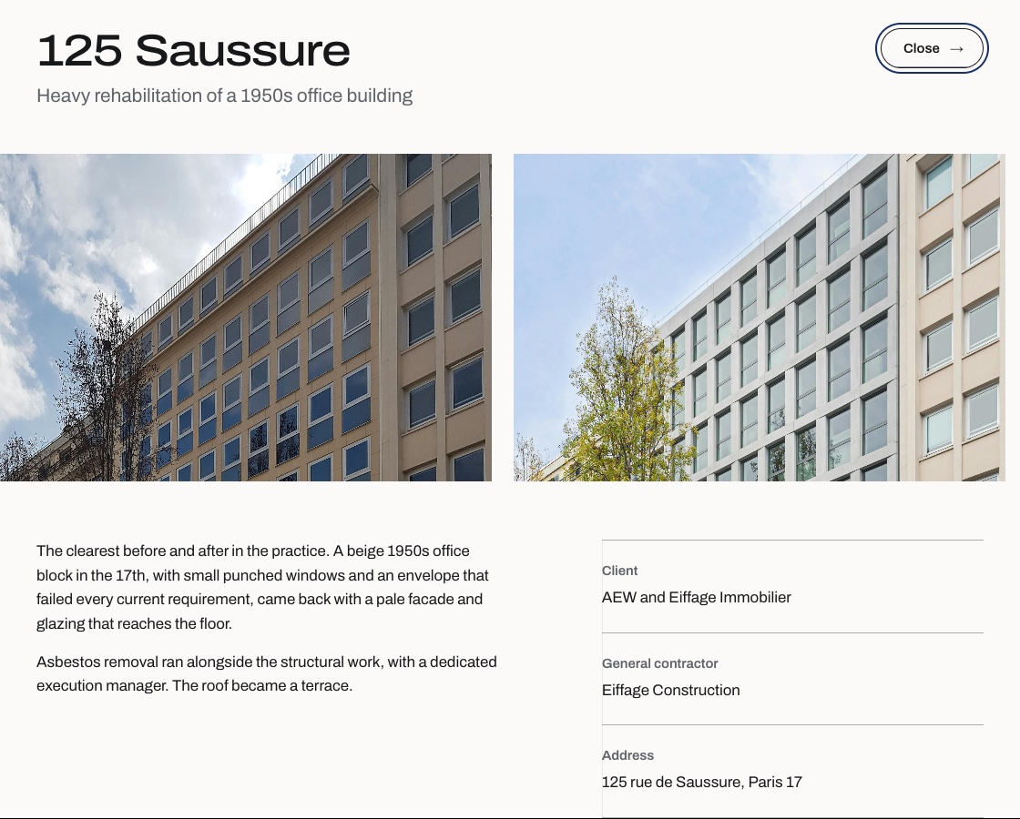
Click a project and the building opens as its own sheet, so the reader never leaves the page. Here it is 125 Saussure, with a before-and-after pair, the story and a technical card with client, contractor and address.
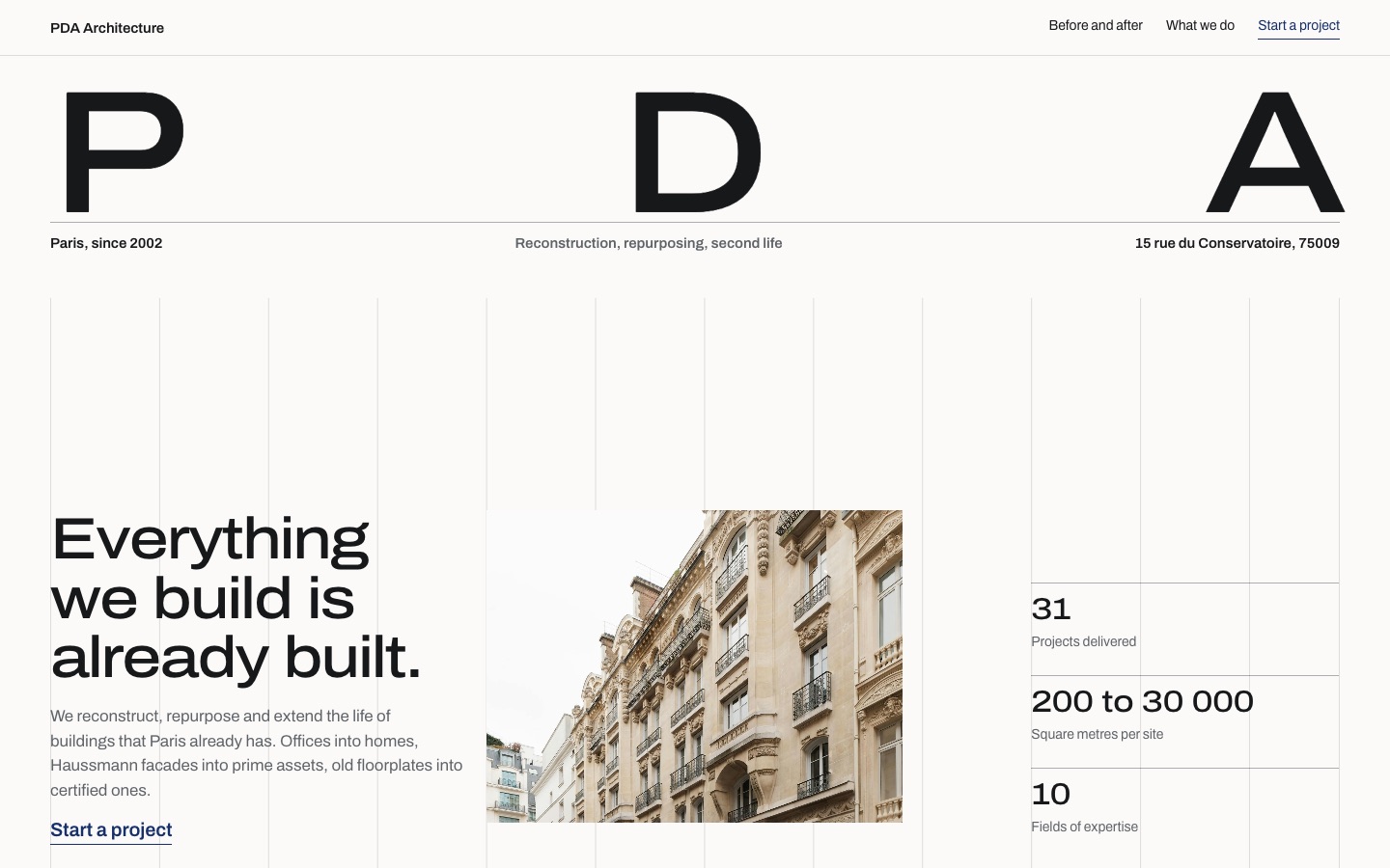
PDA has worked in Paris since 2002. Twenty-odd architects and engineers, clients such as Swiss Life, PIMCO and Gecina, buildings from 200 to 30 000 m². They almost never build on empty ground. They take buildings that already stand and give them a next life.
The people who hire them increasingly decide from abroad. They are fund and asset managers with an ageing office portfolio, and they open the site between two meetings, usually on a phone, looking for one answer. Can these people handle our building?
Each of these made some other part of the page harder. Choosing which part is the design decision.
Column lines are painted on the container at exactly one column's pitch, and every block that carries lines sits on the real grid, so each cell starts on a line. For a practice whose whole argument is structure, the page itself has to show some.
What it cost — it broke twice before it was right, once because cells drew their own borders over the lines and once because a figure row used its own layout without a gutter. Both are now rules in the system.The first matched pair I had was an aerial rendering of an unbuilt research tower. It looked synthetic, and it was going to be the first argument on the page. I found a true pair instead, one corner of 125 Saussure, a built project for a real client, before and after.
What it cost — the two photographs were shot from slightly different distances, so they are aligned by crop until the cornice runs across the seam. It is a quieter image than the rendering, and it is honest.Projects, expertise and team each scroll sideways under the vertical scroll, and each is pinned until its last card is fully on screen. Without the pin the first card leaves before anyone has looked at it and the last arrives as the section exits.
What it cost — the page grew from about 16 000 to 24 000 px, three quarters of it the travel of the rows. The team row goes first if the page needs to be shorter.The people who read this site often open it on a phone, so the phone version was designed alongside the desktop one, not cut down from it.
Click a screen, then scroll inside it

On a computer the links stand in a row. On a phone they fold behind a button, and the list is written only once.
The pinned rows of the desktop page become rows you move with a finger.
Anything that opens on hover on a computer is a plain link on a phone.
Concept redesign, not affiliated with PDA Architecture. Photography and project data belong to the practice and the named photographers. Opens in a new tab.